
It’s rarely enough that you have a decent photo of anything you post online and don’t do any post-editing. Even if it’s a tiny adjustment and unless you’re a professional photographer with good equipment, some level of post editing is needed before you publish a photo for the whole world to see.
This is a continuation of my post-LEGO build process (Part 1 Photography here) and this time, I’ll be taking you through the post-editing steps I do for my LEGO builds. This will range to some simple tweaks and balancing to heavy photo editing and compositing. I’ll try my best to make this as beginner friendly as possible (especially to those touching Photoshop for the first time) but do note that there are multiple ways to do things when it comes to Photoshop (and Adobe in general). The steps I’m highlighting is what I feel is the easiest for beginners although that might not be the most efficient way to do something (being more efficient requires advanced Photoshop knowledge).
A little background about me and doing post-editing
It helps my LEGO builds a lot that my work deals with being a freelance graphic designer and I’ve been using Adobe Photoshop since the late 90s. Back then, my one goal for using the image editing program was to create Gundam backgrounds from scans of instruction manuals so that’s where it all began for me. 20 years later, my use of Photoshop is still roughly the same, creating things I’m highly passionate about and cleaning up photos but this time, it’s my original LEGO builds 😀
I also graduated from a Communication course, was highly active in university organizations that required me to make use of my creative skills (2 years in backstage production designing posters and creative collaterals and another year being a layout editor for our university yearbook) so during those formative years, I really did a lot of post-editing for non-profit and developed a sense of passion and love for what I still do today. But enough about me and let’s get to the juicy stuff!
I teach this to all the Basic Adobe seminars I hold and tell whoever is starting to learn any Graphic Design program that optimizing your workflow is key. You always want to be able to revert any changes you make at any point in time in your file. Ideally, you can easily go back to the original or starting state of your project with a single click or setting.
And always ALWAYS save and do it frequently.
Now you don’t have to do this in Photoshop (honestly think if you have crazy MS Paint skills and can do it from there then why not) but personally, Photoshop is the only image editing software I’m used to (been using Adobe for 20 years) so that’s what I can discuss in depth here from my own experiences.
Note: For demo purposes, my images are set down to 30% quality instead of 100% to save on space so pardon the blurriness.
Welcome to Adobe Photoshop (Ps)

Note the version I’m using is still CS6 but the interface has stayed roughly the same since CS1. Just take some time to orient yourself with the basic interface, noting where the main bar, control bar, toolbar, and panels are. Take some time to orient yourself and play around with a new file, checking out the tools, and customizing the interface to suit your own needs. The best way to learn is to just dig in and experiment with the program (a little guidance helps a lot though).
Basic photo editing
If you simply want to take your photo and clean it up without really modifying the image too much, there’s only a few settings you’d have to pay attention to namely Levels and Curves.
Load up your image in Ps, duplicate the background layer then save your file as <preferred file name>.PSD (PSD is the Photoshop file extension). Doing this makes sure you don’t accidentally overwrite your original photo in your hard drive (remember what I mentioned about being to return to any given state in your project? Optimal and efficient workflow saves times and tears ;P) Also, I would highly recommend keeping your working file in its original pixel dimensions / size or as high resolution to the original file as possible. You can always resize it down later when you’re saving the final output.
Now, 3 easy adjustments you can do to fix your image’s adjustment.

This will affect the layer permanently that’s why you’d want the backup background layer. Basically these 3 settings is the easy way to properly adjust your image’s tones (loosely the relationship of your image’s color to one another and to the whole image), contrast (the richness of your whites and blacks), and color (well.. your image’s color).
Here’s a side-by-side comparison what my before and after image looks like with only the 3 adjustments applied.

I can simply crop this photo to remove the excess part from the DIY photo box I have, Save for Web (Menu > Save for Web), select JPEG at 100% and I’m done! (Oh and save your file :P)

But if you’d like to go a step further and clean up your work or even extract it from the background, check out the next section.
Taking your photo and cleaning it up
Normally out of the 20+ photos I’d take per build, I’d select a few for a special “cover” shot or compiled shot of the build. The thing with uploading your works online is sometimes, you’d want to have your audience focus their attention on an overall image, then check out other images for detail shots, etc.
This part will be a little harder to teach via writing so please do bear with me.
The first thing you’d want to do is extract your subject from your background. There’s effectively 3 ways to do this (ranging from easy to hard) but I’ll just focus on using the magic wand technique as this offers the best balance of control at the basic level.

Take note of the settings I’m using here with a anti-alias and contiguous turned on. Also working with a setting of 15 and I’ll explain these below.
Anti-alias makes sure that your selection doesn’t appear all edgy (with stray pixels) later on when you extract it. Contiguous means it Magic Wand will only select where you click and not select pixels on the whole image. The Tolerance setting affects how much or little Magic Wand selects. This tool works on the concept that it checks the selected pixel’s color and uses this as a basis to select any other pixel within a 15 Tolerance setting (if you have Contiguous turned on, it’ll stop selecting once it hits a “color barrier” outside the Tolerance setting). If I had a stronger Tolerance setting here, I’d end up selecting my build’s grey areas as it’s just a few steps away from the very light greyish background and if I set my Tolerance down to 1, I’d only be selecting pixels by individual pixels. Play around with this setting depending on your build’s color (or you could also use a very differently colored background to make selecting easier).

Notice that part of the elbow got included in my selection and that’s fine for now. We can subtract that from the selection using the Polygonal Lasso Tool later. For now, focus on selecting all the parts of the background that might not be covered by your build.
You should have something like this after the initial rough selection:

Because it’ll be harder to adjust your magic wand to select those tiny spots we missed or overly selected, it’s time to switch tools over to your Polygonal Lasso and do some manual selecting but before that, let’s learn two shortcut keys that’ll make your selecting life easier.

The leftmost picture is the Polygonal Lasso Tool by default. The middle variant (tool + ALT (Windows) held down) subtracts whatever you select from the existing selection. The right variant (tool + SHIFT (Windows) held down) adds whatever selection you make to the existing selection.
Now what you want to do is SUBTRACT the elbow part from the selection since with the 15 Tolerance value, it automatically ate up a bit of that elbow. We then want to ADD the parts we missed for the feet where the shadows make the background too dark for the Magic Wand to pick up at its setting. For my photo, I also add in the the selection the two black areas from my background that wasn’t covered by my white backdrop.
When you’ve cleaned up your selection, making sure you go over all the edges of your build to double check if you’ve missed anything or need to add to the selection. How accurate you are in this step affects a lot of the subsequent steps so be extra diligent here. If you need to do a cleaner version of a selection if Magic Wand did a so-so job, do so.
This is what my image looks like with my selection all done.

Now we need to finalize our selection. Do the following steps:
- Menu Bar > Select > Inverse (or right click on the selected area and choose “Select Inverse”). This now swaps the selected and not selected parts.
- Menu Bar > Select > Modify > Contract. I personally use a setting of 2 pixels here. This contracts our selection all around by 2 pixels.
- Menu Bar > Select > Modify > Feather (or right click the selection – this time inside the mech since we inverted the selection – and click “Feather”). I use a setting of 1 here since we went with 2 pixels for the Contract. This softens the edges and make the image extraction look smoother.
- Menu Bar > Layer > Layer Mask > Reveal Selection. This now uses our refined selection and whatever is inside is retained, whatever is outside is made transparent.
- Create a Layer and put it “below” our layer. Fill it with whatever color you want to serve as a background.
This is what my extracted mech now looks like along with the steps we took and the layer arrangement.

With the extraction done, all we need to do is add in the little details to finish our image.
Adding the extra details and finishing touches
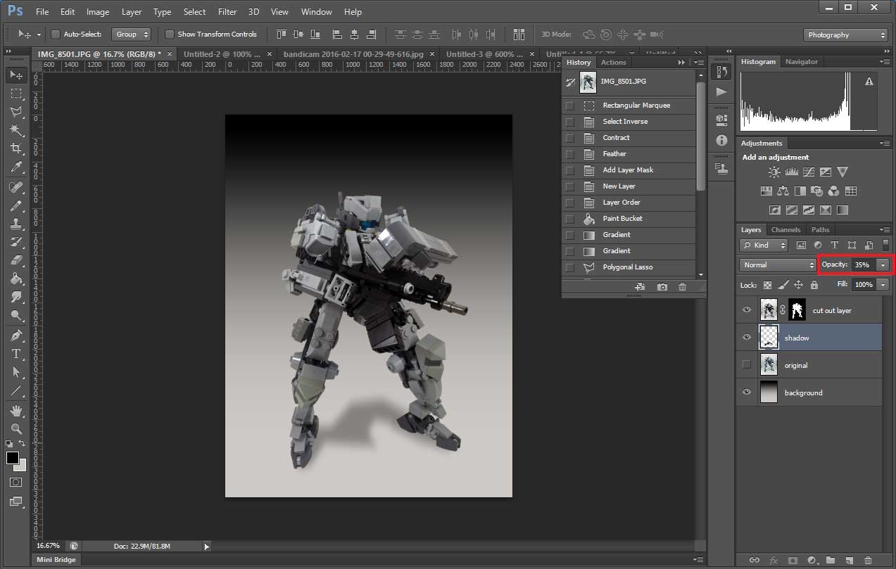
Now we need to add a shadow or it’ll look weird and floating. First I’ll be changing the background to a gradient using the gradient tool. Remember that layer with our original, untouched image? We will need that to trace out our shadow.

Once you have that selection, create a new layer underneath your cut out layer, fill it with black, and do the following steps:
- Menu Bar > Filter > Blur > Motion Blur > 90 Degrees, Distance 100+
- Menu Bar > Filter > Blur > Gaussian Blur > 20 Pixels (you can go higher if you want)
- Set the shadow layer opacity down to 20-40%
I’m also moving my cut out layer and shadow layer down a bit to reposition them better and make room for my header information.
At this point, you can simply add your build’s description, your logo, or your name for watermarking purposes (but do select a decent font for this as a badly chosen font can really break all your work at this point). I’d recommend to keep it simple and functional so go with a nice clean font that’s not too big.
Here’s my final version for this tutorial.

It’s ultimately up to you how you want to do this last part as it really involves your personal style (I tend to be a little more informative than this example, putting my logo in there and adding more information to the build but not too much that it’s an eyesore).
You can also play around with the background more like adding textures here and there. I personally do a lot of “fading out” or masking for my images but that’s an advanced concept and would only recommend it for people who want to research about it on their own (I dedicate a whole month to teaching that when I taught at our local University). I’d highly recommend experimenting and finding your own look and style that really works for you 😉
Hope you picked up a thing or two from this and lastly I’d just like to again say that no matter how well your product or model is, if you can’t present it properly then it doesn’t really show it’s full potential. Invest the time and work in the post-editing as it really adds something extra to your work.
For those interested in LEGO mech building, I put out an eBook over at Amazon Kindle a while back called Mech Wars Instructional Primer. If you’re looking for a resource that could help you start or even improve your mech building skills, you might find this eBook useful 🙂